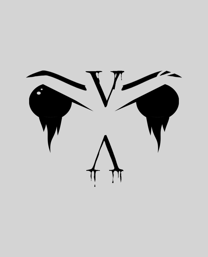
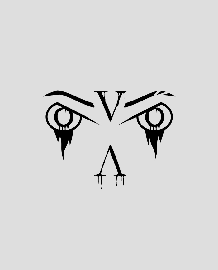
Owl Eyes Secondary Logo

IVA Eyes
This logo was created during a time when I would design a lot of facial features. I would often draw eyes, eyebrows, and lashes but they would always appear more human. I decided to eventually draw those same features but that would resemble an animal instead. It is understandable if someone may not consider this to depict an animal, but to me it depicts the eyes of an owl. The shaded eyes with the 'droplets' added to make it look a bit menacing. To envoke more of a shady emotion.
I decided to jigsaw this design on my Board for the BFA Gallery Show because it was simpler to cut out. It was also another way to introduce a Secondary Logo. I also added led lights in the back to make the eyes glow in different colors.

Owl VA Eyes (original logo)
A pigeon does not have menacing eyes, but an eagle/owl does. Since owls are mysterious and can be considered to be shady, I decided to make the eyes resemble an owl. The eyebrows based off a female, and the V A are supposed to be facial features: outline of the nose and the unibrow area. There are small features about me as well; the eyebrow thats cut off since I have a scar in one of my eyebrows; the Eyes to also represent the letter 'i' & the V and A to represent the other letters in my name (ivan). I decided to leave the letter 'N' out since I did not know where to place it. In other words, I was also inspired by my name when I was working on this design.
Drippy design/shape underneath the eyes. The drippy design in the letters and the eyes correlate with each other. As if the eyes are bleeding, and so are the letters. I tend to also use this drippy design in my other projects.
Gallery Board for the BFA Graphic Design Show (2023)
A large wooden board was given to every Graphic Design student in order to design and decorate, as part of their Graduate Show. The objective was to express our identity/brand and showcase all of our best work. As well as giving away freebies such as business cards, resumes, or other creative gifts like pens, stickers, etc; That would include our logos or business info.
In all honesty, I had no idea on how to design my board since I did not have an identity for myself at the time. I always had a range of logos for myself, but never considered them to be part of my brand. After some time, I knew that I wanted to show two of my best logos that I once created, which were the lion and owl. I did not know how I would implement both, so I first began by drawing a lion on a separate piece of wood and then jigsawed it. I was not a fan of how the lion cutouts came out, so I ended up disposing of the idea. I then did some research on how some former students created their gallery boards, which I began to see a pattern. So much creativity was put into those boards, but I realized that I still wanted to create something new. People have used LED lights in their boards before, but I wanted to use them differently. That is when I decided to draw the "OWL" Eyes logo into the board and then jigsaw it. I wanted to also make the eyes glow with the use of led lights. I only had one chance of cutting the board - Not to mention, it was also my first time doing something like this, so it seemed like a crazy idea for me at the time. Once the jigsaw was done, I was impressed with the results and then decided to paint it multiple colors but ended up switching to Black, which worked out in the end. I ended up using two sets of LED strips and both were 26ft long. The color of the eyes would fade and cycle through multiple colors, but the outline was set in blue.